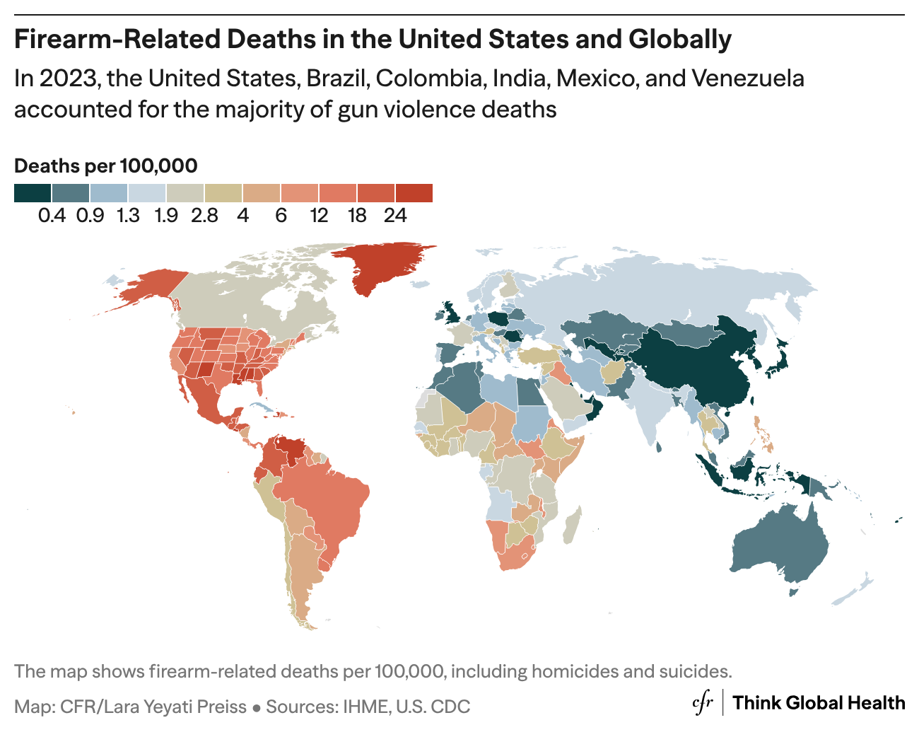
A choropleth of firearm-related deaths, mapped at the state level within the United States and the national level for every other country. Internationally, the U.S. stands out as an outlier, with the highest firearm mortality among high-income countries and among the highest in the world; internally, its rate varies from state to state.
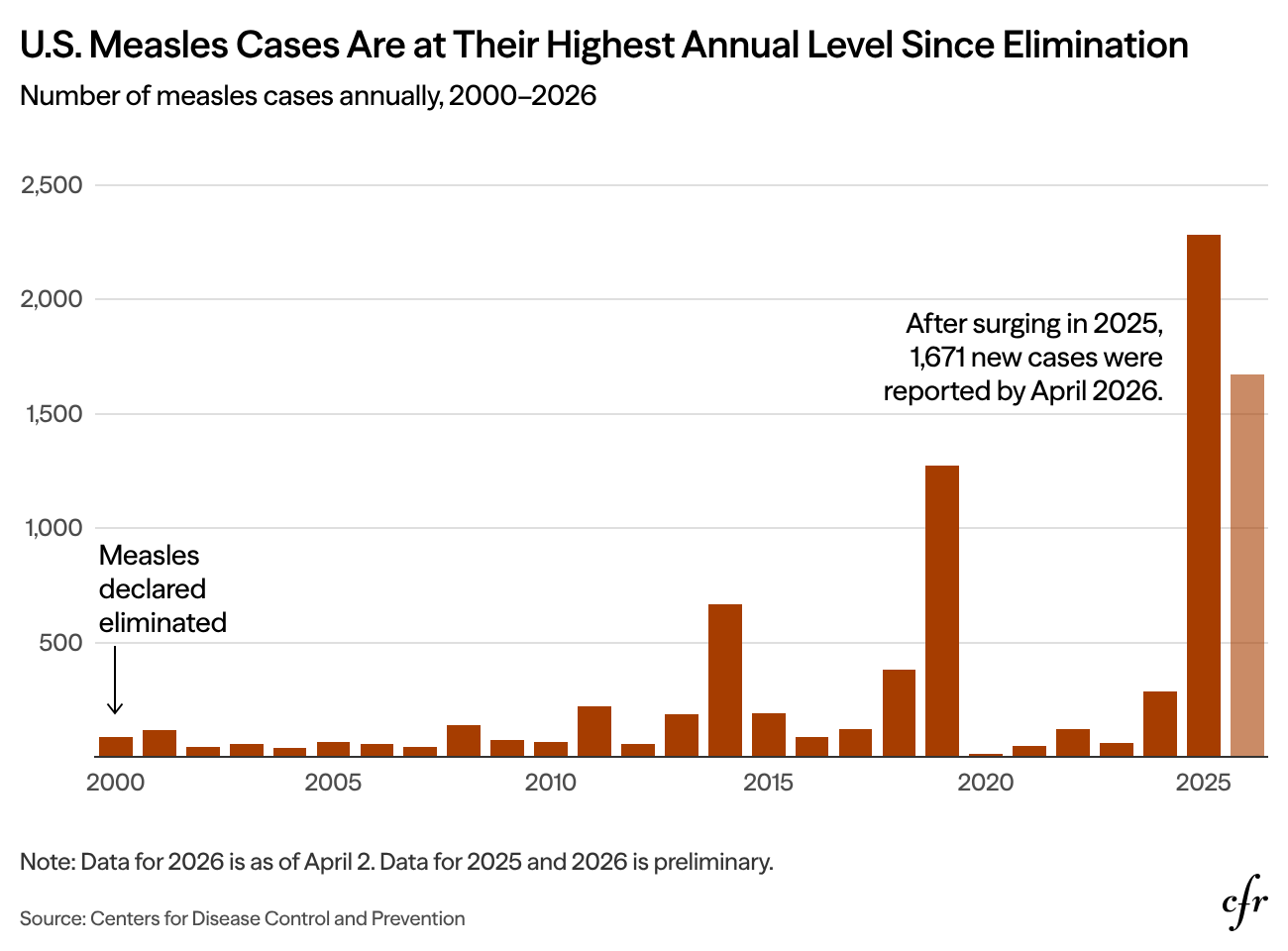
An annual bar chart of U.S. measles cases from 2000 — the year measles was declared eliminated — through early 2026. After a sharp surge in 2025, 1,671 new cases were reported by April 2026, putting the country’s elimination status at risk.
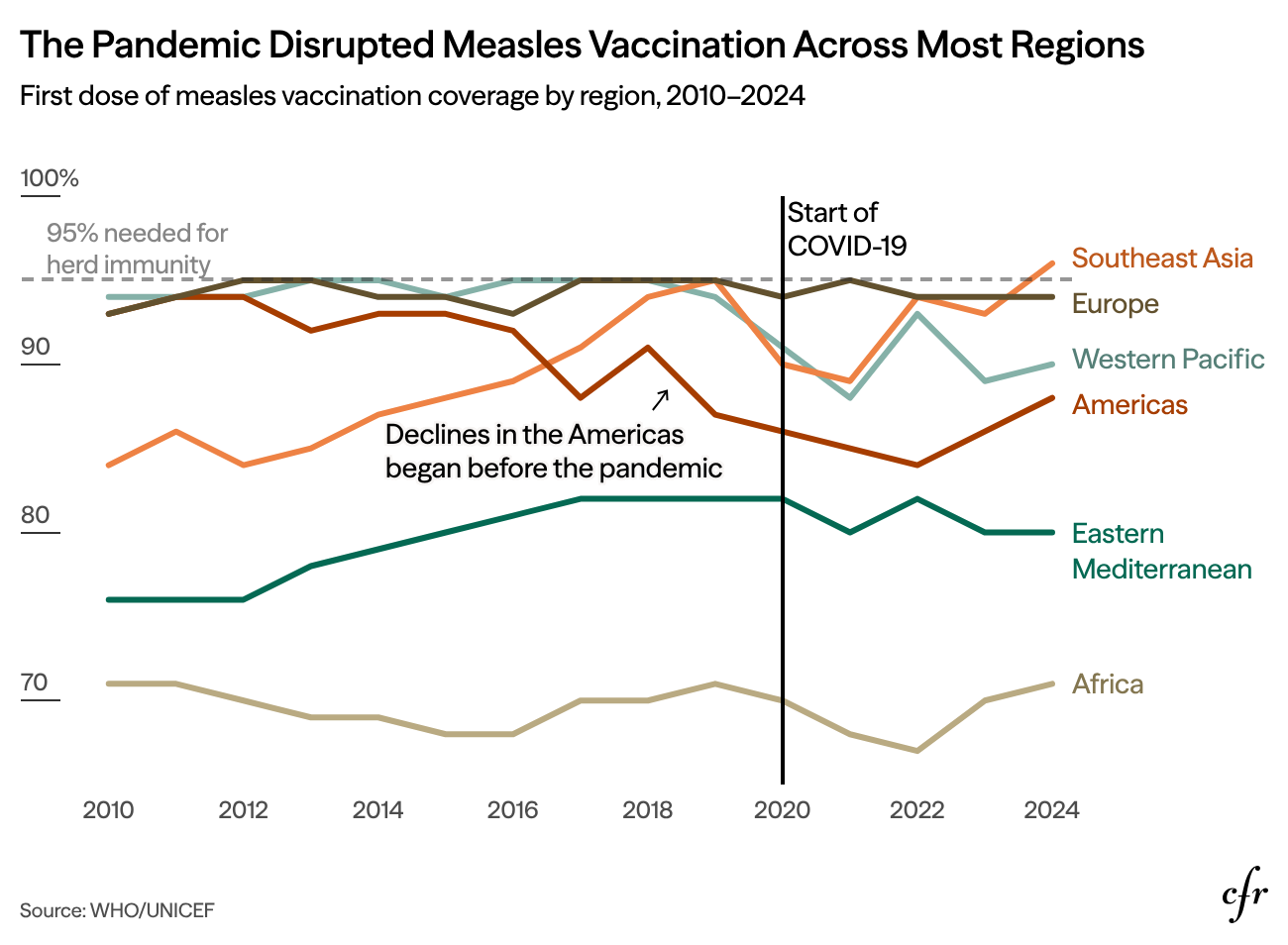
A line chart tracking first-dose measles coverage from 2010 to 2024 across regions, measured against the 95% threshold needed for herd immunity. COVID-19 stalled or reversed progress in most regions, with the decline in the Americas beginning before the pandemic.
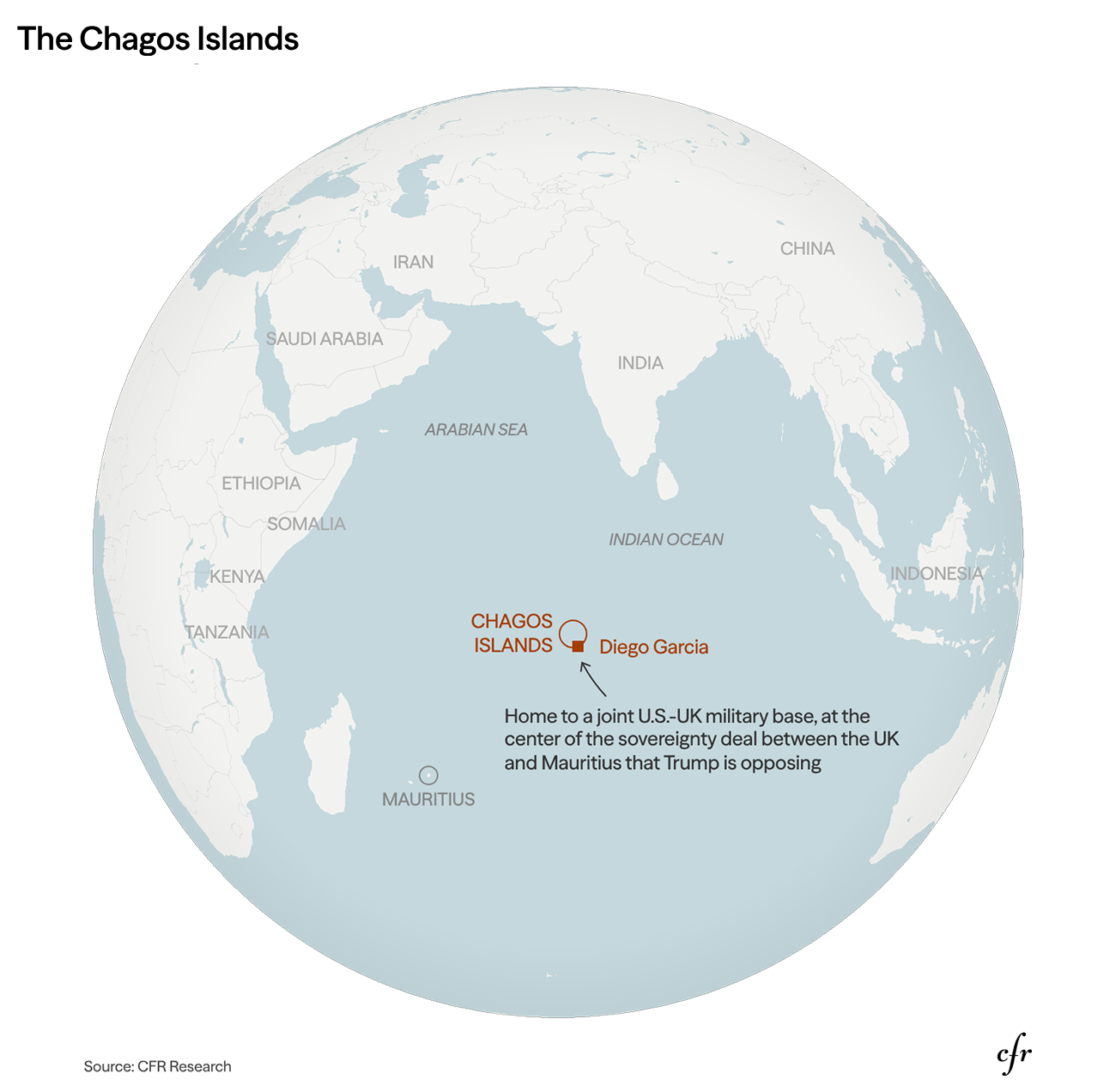
A globe centered on the Indian Ocean, placing the Chagos Archipelago in context: a remote group of islands, home to a strategic military base, caught between a U.S.–UK sovereignty deal and the war with Iran.
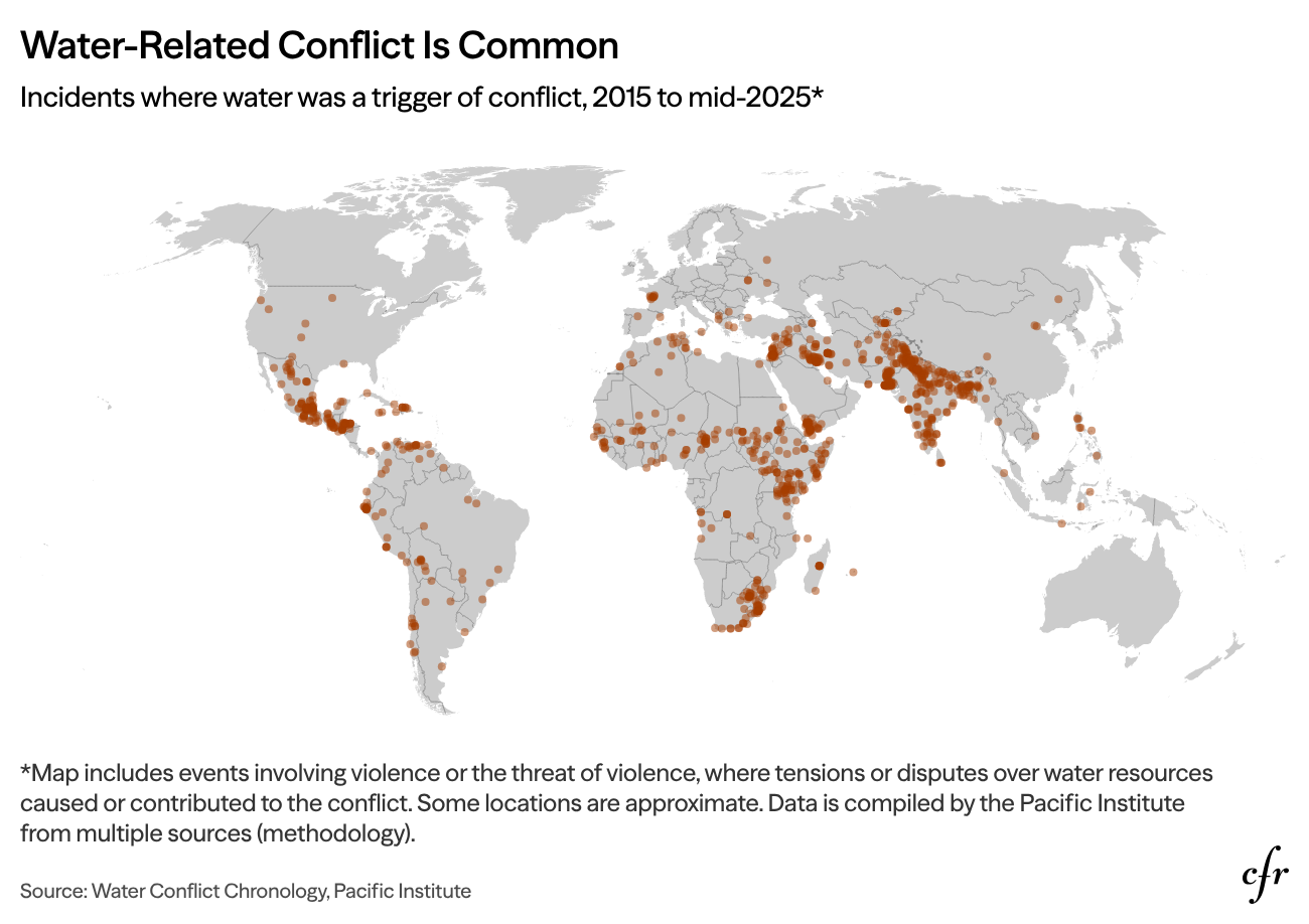
A dot map plotting incidents where water acted as a trigger, target, or weapon of conflict from 2015 to mid-2025, as water grows into a more frequent driver of conflict worldwide.